

An Identity for a Social Entrepreneurship Fund
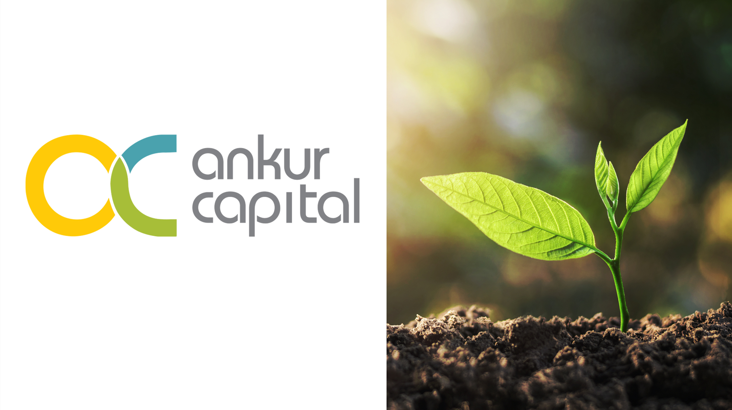
The brief from Ankur Capital co-founder Rema Subramaniam was short ‘. We are seed (ankur in Hindi) capital, who help rural social enterprises, which provide livelihood options. We need a logo’.
The growth of social enterprises is closely linked to their access to capital. So the concept had to clearly establish how critical capital is for a social enterprise. The final logo has an intertwined lower case ‘a’ and ‘c’ where the ‘a’ stands for Ankur and the ‘c’ stands for Capital. The form of the logo is inspired by the form of a seedling – a delicate balance of vulnerability and strength.
The sunny colours used –green, blue and yellow – are all associated with positive and uplifting aspects of nature. Besides figuring in their business stationery and online mailers, the look and feel of the logo is now being cascaded across the Ankur Capital website and in graphics for the interiors of their brand new office.
ClientAnkur CapitalServicesIdentity, Brand ColoursYear2012