

Graphic Design for a Language Learning Startup
When Tiff Chan asked if I would like to create a logo for Chantoneasy—her intuitive tonal method to learn Cantonese–I readily agreed.
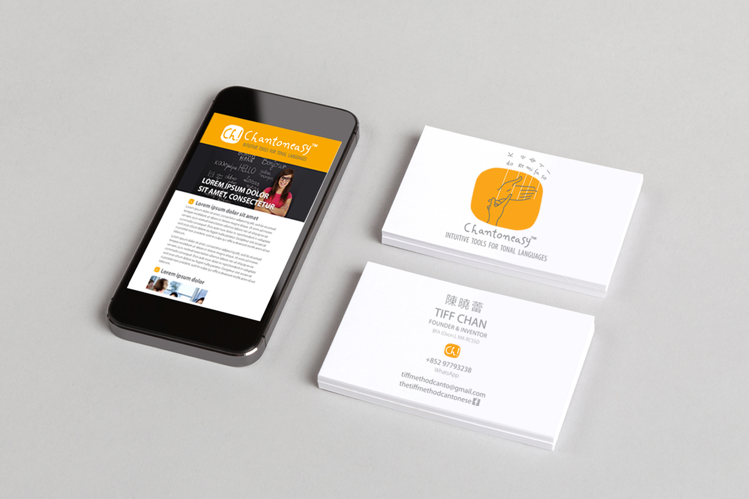
I spent many hours understanding the nuances of her system, which she based on what every school child is familiar with – the universal musical notes do-re-mi-fa-so. Tiff has ingeniously mapped the 5-level tone scale onto the palm of a hand, enabling learners unfamiliar with tonal languages, to use their hands as ready reckoners to get the tones right while speaking. Though the tone symbols are derived from Putonghua pinyin, using the palm to map them is Tiff’s innovative and original contribution to the method.
Creating any identity is a collaborative process
Chantoneasy’s target audience is anyone – absolutely anyone – who wants to learn Cantonese, there are no barriers. Tiff visualised her classes to be lively and informal and her dance/ theatre background helped her achieve that. Creating an identity is a collaborative process and half-way through it, Tiff was very clear that she wanted to use ‘Ch’ as a visual shorthand for the identity. She reasoned, “I was drawing out tables comparing the same Cantonese phrase and how it would be written in Jyutping, Yale and Chantoneasy. I got tired of seeing and having to write out the name so often, so having ‘Ch!’ as an option made me feel a lot better.”
Though I cannot read write or understand Cantonese, I intuitively grasped that the logo had to be non-intimidating and friendly, rooted in a Chinese form, but not cloyingly so. We agreed on a warm, sunny yellow as the brand colour and a font that echoes Tiffs playful personality and her creative, fluid way of working.
Rolling out the Chantoneasy logo
The logo now appears on Chantoneasy’s business cards, their email template, social media posts and all printed materials. Tiff spoke about Chantoeasy at the TedX Lingnan University event in February 2017. Here is a link to the event: https://www.youtube.com/watch?v=6t_jB04q0Ts
My familiarity with the pioneering work done by ShaoLan Hseh for Chineasy helped me understand what Tiff was trying to accomplish. Chineasy has become the world’s most recognized brand in learning Chinese with over 550,000 followers across the internet. ShaoLan’s passion resulted in 5,475 backers on Kickstarter pledging GBP 197,626 to bring her project to life.
The role of thoughtful graphic design is evident in Chineasy’s identity and interface. Mid-range tones complement the sharper signature blue of the identity, while attractive and memorable pictorial flashcards form the building blocks of the Chineasy method.
Tiff Chan’s Chantoneasy method can be used to teach other tonal languages like Putonghua, Thai and Vietnamese too. Like ShaoLun Hseuh, Tiff Chan has entrepreneurial vision, and boundless energy, both absolutely essential for a start-up of this kind to grow.
* http://www.chineasy.com/news*
** https://www.kickstarter.com/projects/shaolanchineasy/chineasy-begins-0?ref=discovery
ClientTiff ChanServicesIdentity, Infographic, Brand ColoursYear2017