In the early 1980s, our small class of aspiring graphic designers spent hours drawing out letterforms by hand on paperboard, perfecting the curves of each letter with ‘super white’ and in the process internalizing their proportions. That was the beginning of my lifelong love affair with typography.
I was introduced to the exacting world of typography at the National Institute of Design in India by Mahendra Patel. Mahendrabhai, as he was fondly referred to by most people, had worked – in the early 1960s — in the Paris Atelier of legendary Swiss typographer Adrian Frutiger, creator of the Univers typeface. Part of the post-war resurgence in Swiss graphic design, Frutiger’s influential work spanned hot metal composing, phototypesetting and digital typography.
My universe is populated by letterforms. Whether its on the streets of Hong Kong, or the chisel cut letters on stone at the classical Forum in Rome, or the many variations in store front signs in the downtown ‘Commons’ of Ithaca, I am intensely aware of the power of typography to set a mood and create an atmosphere. Walking through a California flea market this February, the ability of type to vividly bring alive the socio-cultural trends of an entire period was brought home to me, yet again.
Typography and nostalgia
Two large stemmed red rosebuds, accompanied by the words ‘Rose Bowl’ in a flowing green script outlined with black are boldly inscribed across the entrance to this landmark stadium in Pasadena. The Sunday flea market on the grounds is a sprawl of American retro. The stalls are filled to the brim with grungy signboards, faded record covers, dog-eared board game packaging, rusty highway signage and countless other worn odds and ends, each with its own story to tell. I took photographs of a few that appealed to me and traced the origins of the brands, their graphic styles and identified as many fonts as possible. Since form and content in communication are inextricably bound, many other layers in the graphic narrative get unpeeled as well.
Typography in brand evolution
The clunky all-caps serif font on a 1960s Ralph Lauren ‘Chaps‘ sign, contrasts dramatically with the snooty swirls of the ITC Edwardian Script version used today in Lauren’s top-of-line ‘Purple Label’ and ‘Black Label’ brands. The lettering on the ‘60s sign accompanied by a graphic of a man in a Boy Scouts of America uniform (with Smokey bear hat and wolf insignia) is of a utilitarian clothing company, founded by the Russian-Jewish Ralph Lifshitz from the Bronx in New York City.
The font later changes to the sophisticated ITC Fenice (pronounced Fee-nee-chay) in the then aspirational, but now ubiquitous Polo, complete with imagery of a Polo player on a horse in the midst of a ‘chukker’. It is ironic that the Ralph Lauren fortune was built at a time when manufacturing in the upstate New York area was dying. Most of the clothing brands retailing in US stores today are made overseas, very often in China. Interestingly, along with signature Burberry checks, ‘Polo’ T-shirts are one of the most popular counterfeit brands at the Silk Market in Beijing.
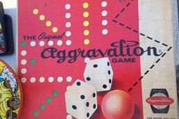
The typographic style on the packaging of the board game ‘Aggravation’ belongs to the early 1960s. The script is upright with thick and thin strokes and an appealing quaintness. The game is similar to the ancient Indian game ‘Pachisi’.
Typography on retro game packaging
The typographic style on the packaging of the board game ‘Aggravation’ like ‘Chaps’ belongs to the early 1960s. The script is upright with thick and thin strokes and an appealing quaintness. Produced first by the Co-5 company based in Michigan, this family oriented board game is similar to the ancient Indian game ‘Pachisi’. ‘Aggravation’ is today owned by Hasbro, which calls itself a global company committed to ‘Creating the World’s Best Play Experiences’. I did wonder though about how many families sat around to play the game anymore; instead they probably sit ‘Alone Together‘ peering into individual game screens or into Xboxes.
Another retro toy package –– the Mattel Carousel –– uses a playful slab serif on a wavering baseline mimicking the up-and-down movement of a carousel. It looks hand-drawn since the repeated characters, especially the lower case ‘e’ looks slightly different in each rendition. The proliferation of easy-to-use typographic software has made hand lettering almost extinct.
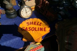
The Shell logo from the 1960s, with a hand drawn, comic book line quality.
Typography and logo longevity
The instantly recognizable pictogram-like Shell logo has its origins–in the form of a mussel shell– and was designed in the1890s. The company had its beginnings in the antiques business of London shopkeeper Marcus Samuel (of Iraqi-Jewish origins), who augmented his business by importing decorative shells from the Far East. Marcus Samuel & Company was among the first to transport oil in bulk and their ship ‘Murex’ was named after a shell. This tradition continues today and all Shell company-owned tankers are still named after shells!
In 1901 the shell pictogram was changed to the present day scallop shell. The version I found at the Rose Bowl flea market is definitely from the 1960s with, a hand drawn, comic book line quality. The word SHELL is in a bland sans serif all caps. In 1971, legendary American industrial designer Raymond Loewy worked on a crisper version of the logo strongly influenced by the prevailing Swiss graphic trends and used a font that is most likely Eurostile Bold Extended, released by Italian typographer Aldo Novarese in 1962. Here’s a great read on how the Shell logo has changed over the years.
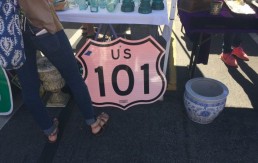
Typography on the roads that built America
I recently started driving in America and am struck by how legible the road signage is, even from a fast moving car. At the Rose Bowl flea market, the rusty interstate signs and automobile plates on display look almost the same as the ones still in use.
In the prewar years, the US Federal Highway Administration developed a highly utilitarian typeface–the FHWA series– referred to colloquially as Highway Gothic. The typeface has characters specially designed to be read at a distance and from moving vehicles. The ‘series’ refers to sets of the same letterforms in different widths. Inter-character spacing rules and line thicknesses are laid out very precisely. The typeface was widely introduced in the early 1950s, is revised every few years and is still in use!
Dan McNichol’s 2006 book, ‘The Roads that Built America,’ about the intricate highway network that crisscrosses the United States, comes to my mind. Among other things, this efficient transport system gave rise to burgeoning individual car ownership and proliferating suburbia, creating a notion of America that is alternately celebrated and reviled.